

At some point, you stop seeing your product as something you built and start seeing it as something you’ve lived inside.
That is where this dashboard overhaul came from.
Over the last five years, I have spent, to my maths, around 10,000 hours inside our dashboard. Not designing it in isolation, but actually using it. Building features on top of it, debugging through it, watching requests move through the network and trying to understand what went wrong when they didn’t.
I’ve also handled just over 6,000 support tickets in the last year. Not AI summaries of or cleaned-up insights, but the real version of where people get stuck. Where something does not make sense. Where a user does something reasonable and the product does not meet them there.
Our old dashboard was not bad. It was fast, powerful, and it did everything it needed to do. It even looked quite good.
But it had a flaw that only really showed up once our customers started using it. It was intuitive… but only if you were me.
That is not good enough.
Design System
Over time, we realised UX problems are rarely just layout. They are usually structured and clear. Not whether the information is present but whether a user can actually parse it.
As an infrastructure platform, we deal with data that is not naturally easy to read (unless you’re a computer). IP addresses, CIDRs, UUIDs, hostnames, data metrics, service identifiers. A lot of it looks very similar or simply overwhelming if you do not already know what you are looking at.
In our previous dashboard, that data was there, but it was not always clear what was what. A proxy IP could look like a client IP, or it could even be the target you’re trying to access. A service ID could look like a random string. Data usage metrics could sit next to usage limit configurations with very little separation.
Nothing was technically broken, but it created constant friction and in practice, hurt customer experience.
So we built a design system specifically for this.
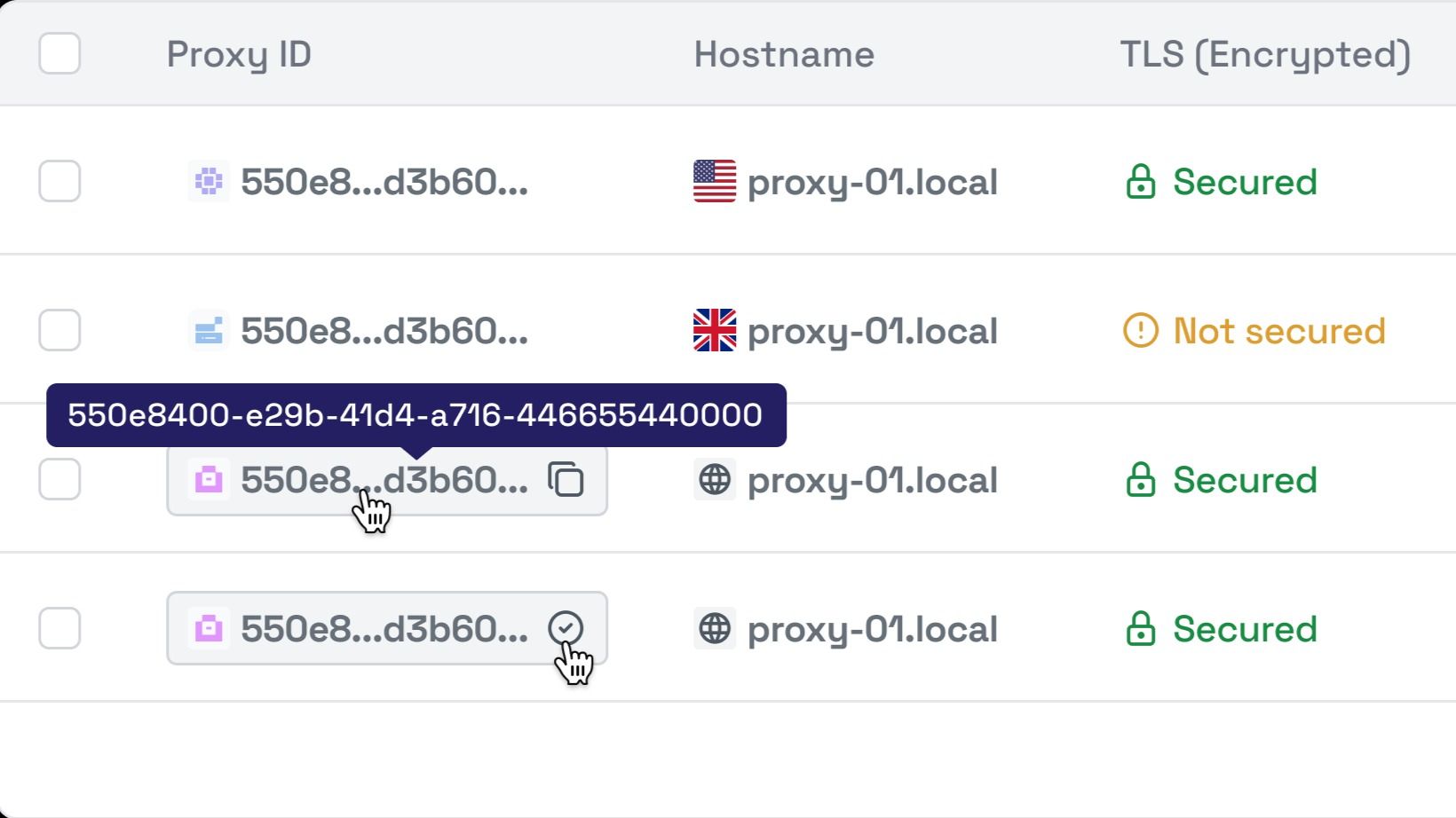
Every data type now has a clear visual identity. Not over-designed, just distinct enough that you can glance at something and understand what you are looking at. Type, identity, metric, metadata. It is obvious.
These patterns are consistent across the entire dashboard. Once you learn them in one place, you do not have to learn them again somewhere else.
Tables were another problem. They worked, but they were inconsistent. Filtering one table did not feel quite the same as filtering another. Columns behaved slightly differently depending on where you were.
Now every table behaves the same way. Filtering, sorting, pagination, column selection. Once you understand one, you understand all of them.
We also moved everything into a fixed-width central viewport. Here one of the quickest code changes had the largest overall effect on UX.
The old full-width layout looked flexible, but it made things harder to read. Important information drifted to the edges and your eyes had to do more work than they should until you ended up looking like Sid from ice-age.
By constraining the layout, the experience becomes more focused. It is easier to follow relationships between data and easier to stay oriented.
Then there is the reality of long data. IP ranges, UUIDs and hostnames (some of these are up to 255 characters?!) do not fit neatly into tables. Before, truncating them meant losing context or having to interact manually to see more.
Now truncated values are still usable. You can hover to see the full value instantly. You can copy without selecting text. These behaviours are consistent everywhere, so they become natural.
We also changed how we use colour.
Instead of just trying to look pretty, colour now carries meaning. Residential services and information about them have a consistent look. Datacenter services have their own, and so on.
You can scan a page and understand what you are looking at without reading every label. It reduces effort in a way that is hard to measure but very easy to notice.
Product Focus
Great. Design is sorted… So are we done? No. The biggest issue with the old dashboard was not how it looked. It was how it was organised.
It grew over time. Features were added where they made sense in the moment. Individually, everything worked. Together, it felt disconnected.
People do not log in to explore a dashboard in the hope of finding what they want. We are not a digital escape room. They log in to use something they paid for.
So we rebuilt the structure around that.
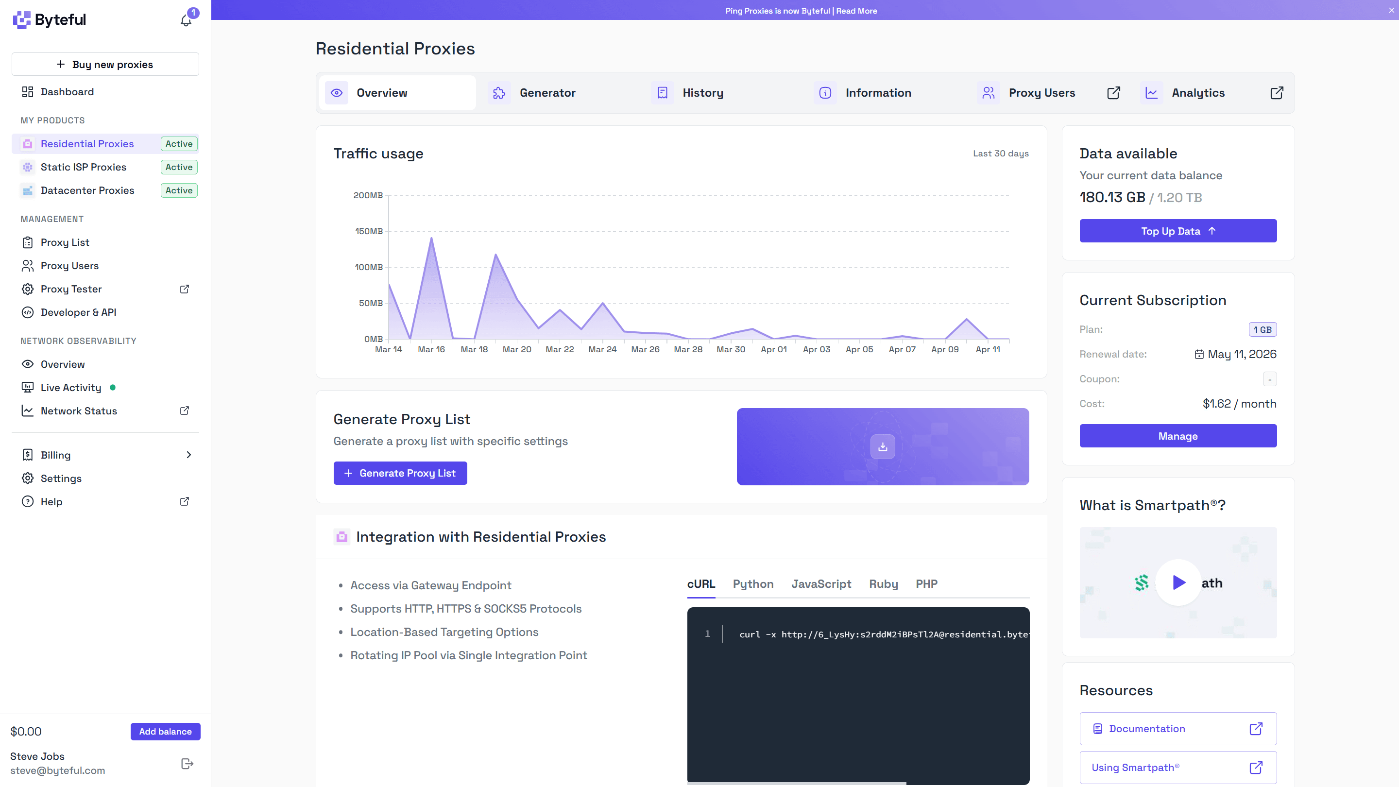
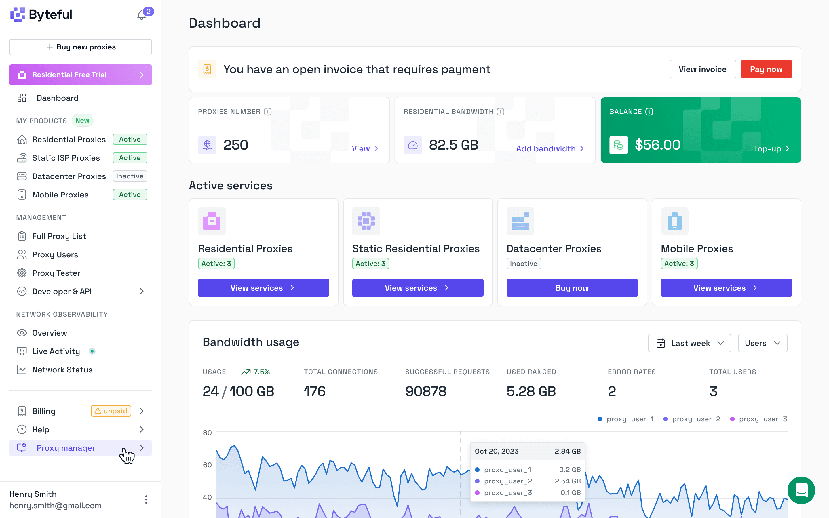
Now everything starts with your services. Each product has its own space, and within that space you see what matters straight away.
Whether your subscription is active. How much you have used over the last 30 days. What you currently have allocated. And how to actually use it.
Implementation is closer to the surface. Code examples are not generic anymore. They reflect your actual configuration, so you can use them immediately.
We also brought supporting content into the product itself. Instead of sending users off on a documentation treasure hunt, we show relevant information where it is needed.
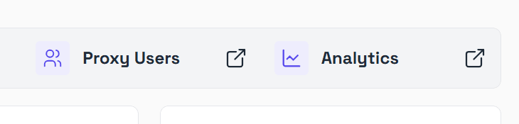
In each product section, we introduced a horizontal navigation. This really helped us organize without overwhelming our users.
Proxy Users, Observability, Usage History, General Information, Checkout. These are things people switch between often, but not all at once.
The new navigation keeps them accessible without cluttering the page while retaining the context of the product.
It turns the dashboard into something you move through, not something you search through.
Intuitive Unification
Underneath the platform, a lot of systems have always been shared.
Observability is the same concept across products. It is logs and analytics. Proxy Users is identity and access management. Proxy lists exist across multiple product types.
The issue was not the architecture. It was how it showed up in the UI.
These systems were scattered. You could reach similar functionality from different places depending on how you navigated there. It worked, but it did not feel consistent.
Now these systems are clearly unified, but accessed with context.
If you open Proxy Users from a specific product, you land in a single interface that is already filtered for that product. You do not need to think about where data lives. You just see what you expect.
The same applies to observability, proxy lists, and ACLs.
Proxy Users is now clearly the IAM layer for everything. Team members, applications, agents. One system that controls access across the platform.
ACL rules extend that, letting you define exactly what each user can access, down to a very granular level.
Proxy lists are also unified. Static proxies, datacenter and ISP alike, are managed in the same place. There is no artificial split that forces you to think about product boundaries when you should be thinking about your setup.
We could have split everything into separate interfaces for each product. That might look cleaner at first, but it would create duplication, inconsistency, and a more complex experience overall. It also would not be enjoyable to maintain.
Instead, we kept the system unified and made the entry points intuitive.
Simple by Default, Powerful When You Need It
One of the hardest problems is supporting the full range of users we have.
Some customers spend a few dollars a month and just want to get started quickly. Others run teams and spend tens of thousands per month managing complex setups for critical workloads.
Both need to feel like the product works for them.
So we focused on sensible defaults paired with overwhelming extensibility.
When you get started, everything works straight away. There is a default proxy user. Access is configured in a way that just works. You can copy credentials and start sending traffic immediately. There is no forced setup or unnecessary decisions.
But when you’ve eventually leveled up and you need more control, it is there.
Proxy Users can scale into a full IAM framework. You can create separate users for different applications, agents, or team members. You can define access rules down to specific services or IP-level restrictions.
None of this is forced on you early but it is there for when you need it.
We applied the same thinking to tables.
Every table starts with sensible defaults, showing the most useful data but similarly, every table is customizable. You can choose the columns you care about.
You are not working around the interface to get what you need.That’s great, and we want to keep serving that level well. But we also realised we were making things harder than they needed to be for everyone else trying to get there.
So we focused on making the developer experience more immediate.
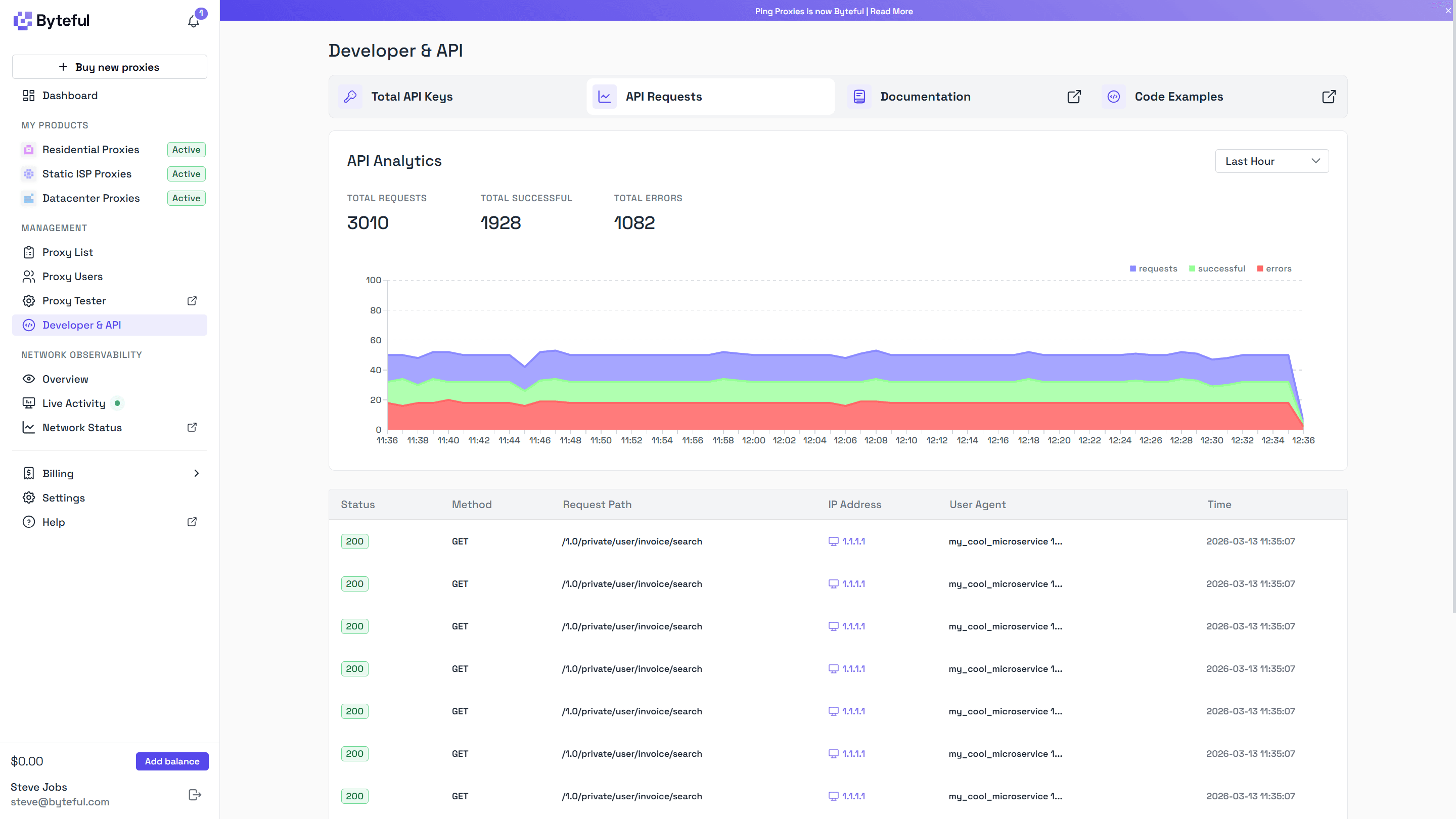
Code examples now include your actual configuration, so you can copy them and use them straight away instead of filling in placeholders. API analytics are now real-time with table and graphing views, which makes it easier to see what’s happening in real time and debug without jumping between tools.
Less time figuring things out. More time building.
The Little Things
A lot of the work went into details that are easy to miss.
When you enable something like Smartpath for the first time, you see a short explanation of what it does. You do not need to go looking for it.
When you download a proxy list, the file is named based on what you selected. You are not left sorting through generic filenames later.
Code blocks are not placeholders. They are real, working code integrations using proxies from your account.
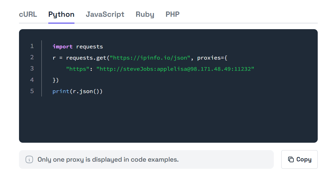
Table preferences persist across sessions, so that the dashboard feels consistent when you revisit. At the same time, you can reset everything easily.
Hover hints are available across complex data types, so you can always see full values when needed.
Each of these is small, but they remove friction from actions that happen constantly.
What’s Next
It is clearer, faster to use, and easier to understand. It works for simple use cases and scales from there.
But this is not a finished state. We build with the Japanese philosophy of kaizen in mind, small improvements, continuously. There is still more to do, sensei.

We are focusing next on billing, team management, and API access roles. As more teams build on Byteful, better permissioning and clearer security boundaries become more important.
We are also continuing to improve the developer experience, especially as workflows become more automated.
This is not the end of the process. It is another step.
This dashboard is the result of years of iteration, thousands of hours of usage, and a lot of feedback.
It is not perfect.